I Built a Desktop OS Inside My Portfolio Site — Here’s How It Actually Works
A breakdown of how I built a full windowed desktop experience into my Next.js portfolio — draggable windows, a taskbar, keyboard shortcuts, and a mobile fallback — without touching the SEO of the rest of the site
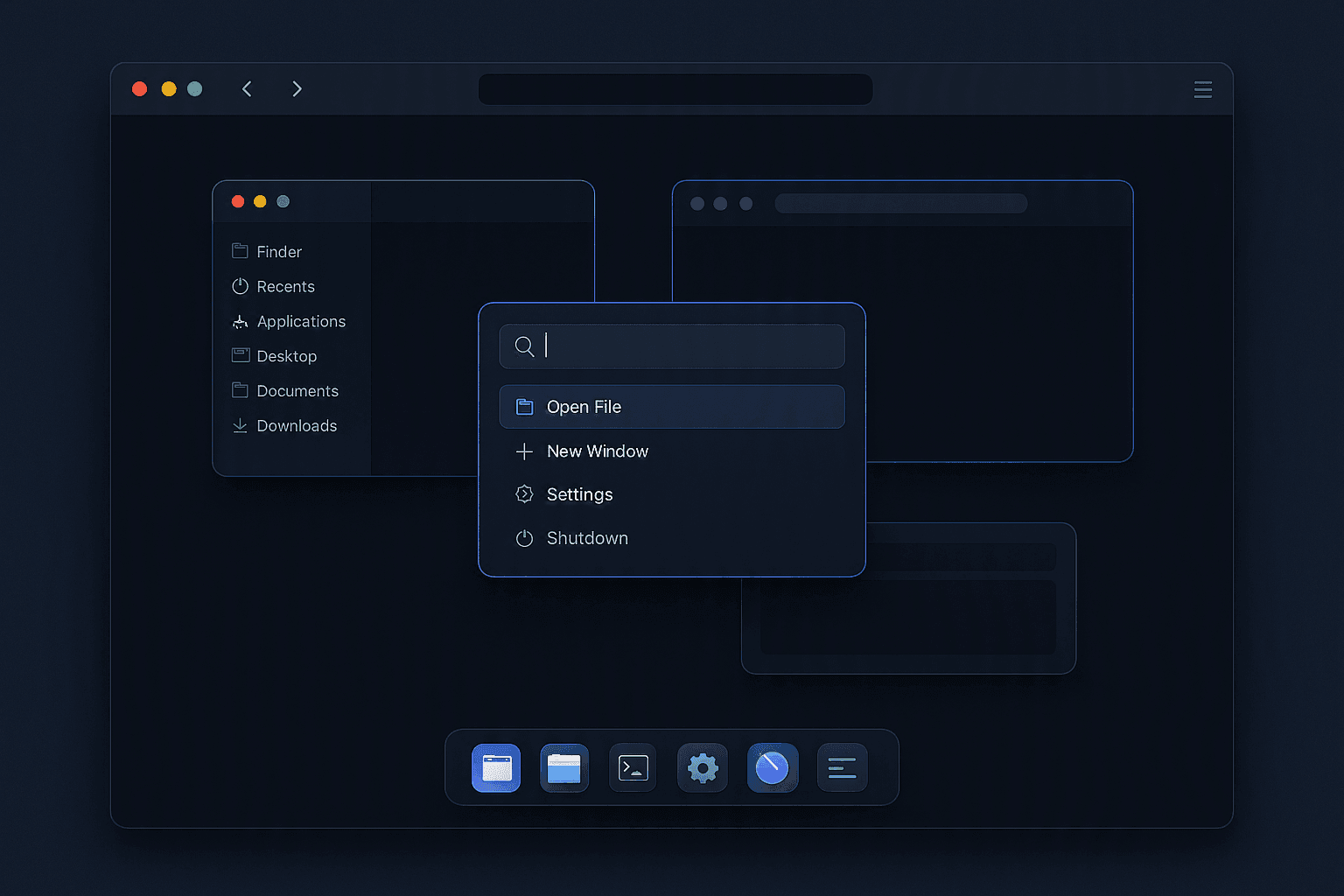
I've always liked portfolio sites that take a risk. Most engineering portfolios look the same, and mine did too, and it did its job. But somewhere around the fortieth developer site I'd scrolled through, some of them genuinely great, I caught myself wanting to just copy the good parts. And a copy of someone else's risk isn't a risk. It's a template with the edges sanded off. So instead of copying, I asked a different question: what would a site look like if it actually showed how I think, not just what I've shipped?
So I decided to add a second, hidden mode where the entire site boots up like a desktop operating system. Draggable windows. A taskbar. A launcher. Keyboard shortcuts. The whole thing.
I didn't want a gimmick bolted onto the real site. If I built this, it had to reuse my real data, stay out of the way of the site's SEO, and degrade honestly on mobile rather than pretend to work there. So I started by making the desktop a real route. From there, I worked outward.
The Entry Point Is Just a Route
The desktop isn't a toggle, an overlay, or a client-side flag. It's a real page.
src/app/desktop/page.tsx is a plain server component with no data fetching, so it remains statically rendered like the rest of the site. You get there the same way as anywhere else on my site: a normal <a> link and a "Switch to desktop view" link in the navbar.
Why this matters: no query params, no client-only state gate. The rest of the site's ISR (Incremental Static Regeneration) is unaffected by this page, so the desktop behaves like any other page, not a special routing case.
One Array Is the Source of Truth
Every icon, every launcher entry, every window on the desktop comes from a single apps.ts registry — an array of DesktopApp objects:
interface DesktopApp {
  id: string
  title: string
  icon: Icon
  defaultSize: Size
  tint: 'primary' | 'accent'
  render: { component: PanelKey } | { href: string }
  pageHref: string
  hidden?: boolean
}
A few decisions baked into that shape:
- Tint drives the taskbar dot and icon badge colour. It's a small touch but makes the desktop feel designed rather than assembled.
- render is a discriminated union:
componentrenders a native panel (about, projects, blog-reader, tutorials-reader, settings, shortcuts), whilehrefrenders an iframe. In the current build, every app is a native panel. I dropped iframes entirely once I realised native panels could call the same data-fetching functions as the real pages. - pageHref is the real route each app mirrors. It's used by the launcher and by the mobile fallback card, so a phone visitor who can't use the desktop still gets a real link to the content.
- hidden: true keeps an app like Shortcuts openable (via
?) without cluttering the icon grid. Not every window needs an icon.
The registry pattern is the whole trick. Adding a new "app" to the desktop is one array entry, not a new component wired into five places. The takeaway: one registry keeps the desktop easy to extend and hard to break. It keeps the system simple, predictable, and easy to grow. Next comes the shell and how it keeps state under control.
The Shell Owns Just Enough State
desktop-shell.tsx is the orchestrator, and I was deliberate about keeping its state small:
windows: { appId: string; z: number; minimized: boolean }[]
focusedAppId: string | null
That's it. No position or size, just which windows exist, their stacking order, and whether they're minimised. The shell is responsible for:
- Opening, closing, focusing, and minimising windows, with a z-index counter for stacking order
- Computing a cascaded starting position for each newly opened window, offset from the last
- Driving the boot overlay (
bootedstate), the launcher, and the contact panel - One global keydown listener with a clear priority chain — Ctrl/Cmd+K toggles the launcher, Escape closes the launcher → contact panel → focused window in that order,
?opens Shortcuts, Shift+Arrow sends a snap command to whichever window is focused - Falling back to a "you need a bigger screen" card on mobile, via a
useIsMobilehook
That priority chain on Escape took a few passes to get right. The instinct is to just close "the top thing," but a launcher opening and a window opening need a specific, predictable order or closing things feels random. The key takeaway: keep the close order explicit to maintain a predictable experience. That boundary matters because the shell and each window have different jobs.
This was the most important architectural decision in the build, and it's the one I'd get wrong if I did this again without thinking it through. The core lesson: keep state with the thing that owns it, not in the shell. Keep that boundary clear, because the shell and each window have different jobs.
window-frame.tsx is the actual window manager for drag, resize, and maximise. Position, size, and maximised state are stored locally within each WindowFrame instance. They are never lifted to the shell.
Here's the reasoning:
- A window stays mounted for its entire lifetime; it's only removed from the DOM on close. Minimising doesn't unmount it.
- Because of that, local state naturally survives, minimises, restores, and refocuses. There's no "save position before minimise, restore position after" logic to write or get wrong.
- More importantly: when something else re-renders another window opening, a theme toggle this window's DOM subtree isn't touched at all, because nothing about its own state changed.
That last point sidesteps a nasty bug: GSAP's Draggable applies an imperative CSS transform during a drag, outside React's render cycle. If a window's position were in shared shell state, unrelated re-renders could cause React to fight the transform GSAP applied, causing stutters, snapping, or a window that "forgets" where you dragged it. Keep position local so React and GSAP never contend for the same node unless that window changes.
Two small hooks carry the actual gesture math, split out of the component itself:
- use-window-drag.ts wraps GSAP's Draggable per window. On the drag end, it folds the accumulated transform delta into a committed
{ left, top }and resets the transform to a clean baseline for the next drag. It also checks proximity to the shell's edges and reports a snap target: top edge → maximise, left/right edge → half-screen. - use-window-resize.ts is hand-rolled pointer-event math for all 8 edge and corner handles since GSAP's Draggable doesn't do resizing. Bounds are applied imperatively during the gesture for a responsive feel and committed to state only on pointer-up.
A forwardRef + useImperativeHandle exposes a snap() method on each window, so the shell's keyboard handler can tell whichever window is focused to snap without ever needing to know or touch that window's internal position state. Expose only the control the shell needs, and nothing more. With that in place, the rest of the chrome stays intentionally small.
The Chrome Is Small on Purpose
taskbar.tsxlists every open window (not just the focused one), plus the launcher toggle, an "Open to opportunities" pill wired to my realpersonalInfodata, a theme toggle, and a clock.launcher.tsxandcontact-panel.tsxare floating panels toggled from the taskbar.boot-screen.tsxplays a short progress-bar animation on every shell mount, skipped entirely underprefers-reduced-motion, because a fake boot sequence is a joke the first time and an accessibility problem every time after that. With the shell set, I kept the content real.
The Content Is Real, Not a Demo
This was non-negotiable for me: the panels inside panels/ aren't mocked-up placeholders; they call the exact same Server Actions the real pages use. projects-panel.tsx and reader-panel.tsx (shared by the Blog and Tutorials apps) call getProjects, getBlogPostsSummary / getBlogPost, and getTutorialsSummary / getTutorial directly from client components. That way, the desktop stays tied to the same data layer as the rest of the site.
The one bit of plumbing that required work was that projects.ts needed a file-level 'use server' directive to match the pattern already used by blog.ts and tutorial.ts. Small change, but it's what lets a client-side window panel reach straight into the same data layer as a statically generated page. That keeps the content real, not a demo, and leads into what I left out.
about-panel.tsx reads from personalInfo / aboutContent and only renders its Skills/Experience tabs if those arrays are actually non-empty. They're empty today. No fake content, even in a window that's ostensibly "just for fun."
What I Deliberately Left Out
Every build like this can turn into a rabbit hole, so I scoped it hard:
- No Home app. It was in the registry at one point, and I cut it. About, Projects, Blog, Tutorials, Settings, and Shortcuts cover everything worth covering, and each is now a native panel. No iframes anywhere in the current build.
- No persisted "remember I was in desktop mode." The obvious way is to redirect
/→/desktopbased on a stored preference. I rejected that because it would make the canonical entry point to my site no longer a plain, crawlable, statically rendered page. SEO lost that argument on purpose, and mobile gets a fallback card instead. That leaves the ending clear: desktop is a deliberate mode, not the default path. - Mobile gets a fallback card, not a shrunk-down desktop. Draggable, resizable windows on a touchscreen are a worse experience than no desktop mode at all, so
useIsMobilejust swaps in a card pointing at the real page instead of trying to make dragging work with a thumb.
Key Takeaways
- One registry array beats scattered wiring. One
DesktopApp[]drives icons, the launcher, and window rendering. Adding an app is one entry, not five edits. The main lesson is simple: keep the shell small, keep state local, and let the desktop stay easy to extend without breaking the rest of the site. - Keep shared state coarse; keep instance state local. The shell only tracks which windows exist and their order; each window owns its own position and size. That split is what kept GSAP and React from fighting each other. The takeaway: choose the state boundary that preserves behaviour, not just structure.
- Imperative animation and React reconciliation don't mix well without a boundary; local state per window is that boundary.
- A fun feature doesn't get a pass on real data or accessibility — same Server Actions, same content,
prefers-reduced-motionrespected. - Know what you're protecting. SEO and mobile usability aren't casualties of a feature like this; they're the constraints you should design around from the start.
That's the gap I was actually trying to close, not a portfolio that impresses for ten seconds, but one that shows how I think, not just what I've shipped. The desktop mode is one answer to that. It won't be the last thing I try.
The code is open source if you want to see how any of this actually fits together: the registry, the shell, the drag/resize hooks, all of it.
If you want to see it running instead of reading it, there's a "Switch to desktop view" link in the nav on desktop. On mobile, it'll just point you to the regular pages for now.